Wednesday 7 August 2013

Mapping Ultimate Scoring Probabilities

The sport of ultimate is one I love both as a player and as a fan. Over the past two summers the NexGen tour has featured a team of College All-Stars embarking on a continent-wide tour to play exhibition matches against local club teams and generate hype for the sport through camps and other events.

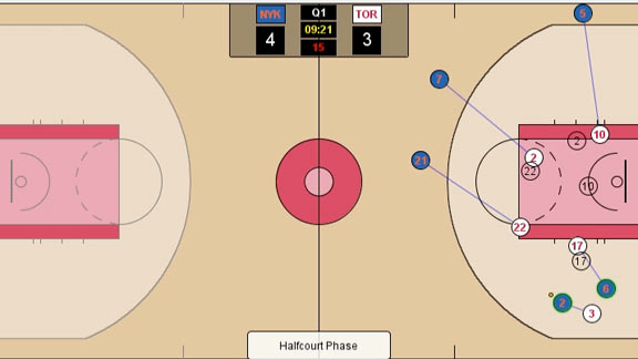
Contributors from the popular ultimate website UltiWorld analyzed the NexGen 2012 games using a newly developed spatial program for generating spatial-linked ultimate data called Ultiapps. Ultiapps allows users to generate spatial data on the locations of throws, catches, and turnovers which can be used to map the movement of the disc across the field. Of course, Ultiapps also allows you to view the results of traditional statistical categories like goals and assists, as well.

The really interesting part of this to me is the analysis the authors have developed, starting with this online article. What is really neat about this is the scoring probability maps that were created which show the probability that the possession will result in a goal for NexGen given that the disc is located at a given location on the field.
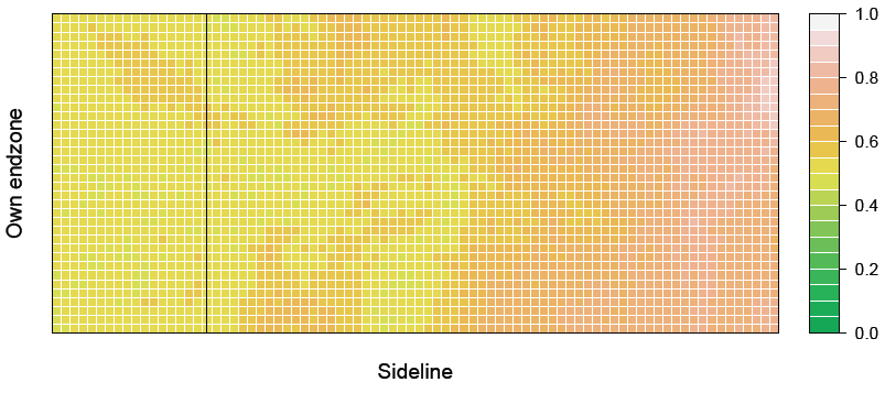
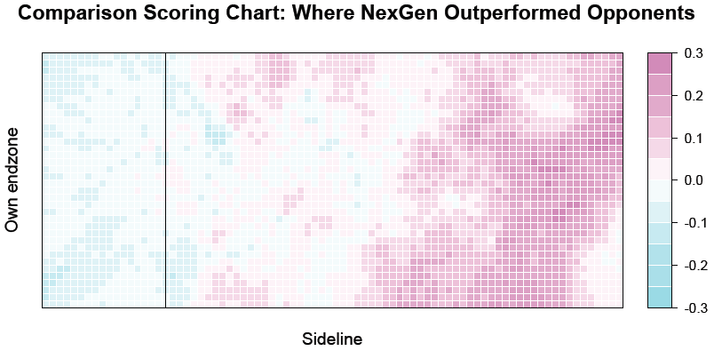
With this map you can see some neat trends, for instance, the probability of scoring seems to favor getting the disc to the right-hand sideline. The authors also compiled the same map for NexGen opponents which facilitated spatial analysis of the differences in effectiveness at scoring from different locations between NexGen and the teams they play against. Purple areas in the map below show where NexGen was more effective, while blue areas are where opponents were more effective. 

The methods for deriving these scoring probability maps are outlined in a more technical article found here, that the authors have submitted are presenting at an upcoming machine learning conference.

This idea is really neat, and it relates nicely to some work I am currently looking at extending the concepts of shot location in evaluating goalies in ice hockey to an improved shooting percentage model. It would also be neat to examine the raw probability of scoring on a single throw maps for comparison. This would decrease the number of data points considerably, but would be interesting in terms of looking at teams huck success etc. Finally, as the authors suggest, incorporating some ancillary variables, for example, force or wind conditions, could really improve the usability of this type of spatial analysis by the ultimate community.

Nice work!

Wednesday 20 March 2013

More on Basketball Tracking Analytics

Grantland regular contributor Zach Lowe has written frequently about the developing group of teams in the NBA employing SportVu tracking systems for more advanced analytics. In his most recent post (and follow-up) he reveals much about how the Toronto Raptors are utilizing these systems to examine team defence. Defence has long been the final frontier for statistical analysis, with people often citing the intangibles associated with good defence as being unquantifiable. It seems like this sentiment might be changing. Pretty cool.
Raptors/Knicks

@ZachLowe_NBA

Sunday 10 March 2013

Mapping the NHL Realignment

Recently, the NHL and NHLPA have come to an agreement for realigning the conferences and divisions for the 2013-2014 season. This move has been spurred by the relocation of the Atlanta Thrashers franchise to Winnipeg in 2011, becoming the Jets. Due to the proximity to the start of the season, the Jets were simply placed in the Southeast division for the 2011-2012 season. Due to the lockout, other items ruled the agenda, and a more appropriate division for the Jets was put on the back-burner.

Here, I'll take a look at maps of the newly proposed conferences and divisions, and look at changes in the within-conference and within-division travel distances, which I term links.

This first map shows the existing and proposed conference links.

On the left are the links from the existing conference alignment, and on the right the new alignment. Two major differences emerge. First, Winnipeg moves from the East to the West. This is a logical move, as Winnipeg is the in the central timezone, while all Eastern teams are in the eastern timezone. Second, Columbus and Detroit move from the West to the East. This move has been advocated for some time, as both cities are located in the eastern time zone. However, this change results in a competitive unbalance as the new Western conference alignment has 14 teams compared to 16 in the East.

How does the realignment affect travel distances? In the existing alignment the average link distance in the East is 1028 km and 1920 km in the West. In the new alignment we see both these values decrease, East: 855 km, West: 1842 km. Inevitably, there remains a travel advantage to being in the Eastern conference.

Now, lets take a look at changes to the Division structure.
On the left we have the 6 division format in the existing alignment, and on the right the 4 division format in the new alignment. It is clear to see the inappropriateness of Winnipeg in the Southeast division in the existing algnment, as Winnipeg is closer to all teams in any of the Central, Northeast, or Atlantic divisions, than any other team in the Southeast. The new alignment, features the rather unusual Central division, where the two Florida teams are included with the three Canadian teams (Montreal, Toronto, and Ottawa) and Boston. Geographically, this may not make a lot of sense, but perhaps is motivated by the strong Canadian fan base in Florida from travelling snowbirds.

Again, what are the average within-division link distances?
Atlantic: 249 km
Northeast: 437 km
Southeast: 1654 km
Central: 547 km
Northwest: 1364 km
Pacific: 1174 km

In the old alignment we had some noticeable inequalities. Clearly, the Southeast division had some problematic travel requirements, however not that much different from that of the Northwest.

In the new alignment?
Atlantic: 439 km
Central: 1186 km
Mid-West: 1145 km
Pacific: 1364 km

Here we see a relatively even distribution of travel distances in three of the divisions, but the Atlantic division (containing the teams from the Eastern seaboard) has a much lower average link distance.

Overall, the proposed realignment is designed to ease travel burdens associated with teams like Winnipeg, Detroit, and Columbus, and it appears to do so.


Notes: Links were defined as the great-circle path connecting the two cities. Maps were created using the Lambert Conformal Conic projection. Data on city locations and the background polygons were obtained from Natural Earth, and the analysis and maps was done using the statistical software R.

Monday 4 March 2013

Recent Links - Including MIT SSAC'13

Just to update with some recent links.

Damien Demaj, whose work on tennis I profiled in a previous post, now has a specifically focused spatial-tennis blog:
http://gamesetmap.com/

He has expanded his previous work on the Murray vs. Federer match, and is looking at some much more advanced spatial metrics for analysing shot patterns in tennis.
@DamienDemaj

Kirk Goldsberry is continuing to revolutionize basketball analytics by looking at spatial patterns in field goal attempts (and percentages). He is now being featured on ESPN's Grantland. At the MIT Sloan Sports Analytics Conference (SSAC) he presented a research paper on new interior defence metrics. Previously, he has also looked in detail at the spatial shooting percentages of Tony Parker of the San Antonio Spurs.
@KirkGoldsberry


Other links from the MIT SSAC that I found to be interesting include:

This paper by Wei, Lucey, Morgan, and Sridharan, which relates nicely to Demaj's tennis work.

This paper by Philip Maymin categorizing NBA plays based on the locations of acceleration events. Acceleration events are computed from the amazingly detailed NBA SportVu tracking data. I find particularly interesting the final figure (Figure 8, see below) which shows the amazing detail of this trajectory/movement data.
I think there is tremendous opportunity for analyzing the movement paths of, and interactions between, players (and the ball) using the NBA SportVu data. Great stuff!

Looking forward to recap videos on:
  • The XY Panel: The Revolution in Visual Tracking - presented by Sportvision
  • Soccer Analytics - presented by Prozone

Related to the NBA SportVu data, check out this recent conference paper by Gudmundsson and Wolle, at ACM SigSpatial, where the authors begin to develop more advanced spatial-temporal metrics for analysing trajectory data in football (soccer). Really neat stuff to think about as these datasets (and computational tools) begin to develop!


Coming soon: Mapping the Proposed NHL Realignment Plan


Sunday 18 November 2012

(Geo) Visualizing the NHL Lockout

If you are like me the current NHL lockout is tearing your heart out. One good thing that has come from it however is this map titled Getting Ice Time by Kevin Hibma, a software engineer at ESRI -  the maker of the uber-popular GIS software suite ArcGIS.


The map Getting Ice Time by Kevin Hibma shows the movement of NHL players from North American teams and cities to European teams and cities during the present NHL lockout.
The map is dynamic so that when you click on a line you bring up some background information, including NHL salary, about individual players. When you click on a point symbol, it gives you information about the team situated there (e.g., the buildint they play in, etc.).
 
Each red star depicts the location of the 30 NHL teams, while the orange stars represent minor-league and junior affiliates. Many young players have moved from their current NHL teams minor-leauge affiliate team - some even going back to the junior ranks - during the lockout to hone their skills and get some more ice time. The movement of these players is shown using orange lines for players going to the minors, and yellow lines for players returning to the junior leagues.
 
As you can see the map is dominated by green lines, representing players moving overseas to play in the European professional leagues. A number of European NHLers have returned to the teams they grew up watching, but many North American born players have also decided to play in Europe.
The colors and symbols (circles and squares) are used to depict the different leauges. For example the Russian league (KHL) is shown using red circles. Each icon represents a team location, so note that not all teams have added locked-out NHL players to their rosters. The map also includes some social media links (tweets and facebook) related to the NHL lockoout that you can click on and read/view.
 
The lines on the map are shown using great circle routes, which represent the shortest distance as-the-crow-flies between the two locations on the globe. The use of great circle route lines make for a pleasing visualization, one you may be familiar with from back-of-the-seat airplane magazines.
 
Overall, just a really cool map showing a bunch of information about players involved in the NHL lockout which can be used to learn more about professional hockey teams abroad. An article on ESPN.com has featured this map, along with some comments from the creator. Thanks to my pal Ben Stewart who passed the link on to me.
 
Nice job Kevin!